Hello! I’m a writer and journalist currently self-publishing my first novel, a psychological thriller called The Ghost.
I chose the self-publishing route because I was eager to get my story into the hands of readers while retaining as much creative control as possible. After attending the Writers & Artists Self-Publishing In The Digital Age conference in November 2014, it seemed clear that self-publishing was the way to achieve that.
I decided to go with Matador, the self-publishing imprint of Troubador Publishing, because of their hybrid approach – offering author autonomy with the industry-standard professionalism of commercial publishing. (They are selective about which books they choose to publish and, to some degree, authors are expected to conform to certain house styles.)
Having spent most of my working life as a writer and editor, I was concerned that my standards would be exacting – or even exhausting. But the Matador publishing team have been unfailingly positive, flexible and supportive. They have refined the rougher edges, tolerated my tweaks and counter-tweaks, and steered me away from unworkable ideas with the utmost diplomacy.
This blog will be in three parts, each covering a different aspect of my experience – Cover Design, Editing and Marketing.
Part One – Cover Design
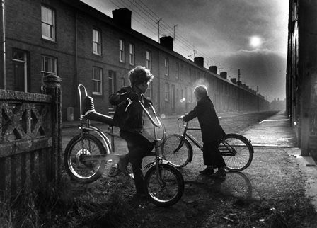
Before signing with Matador, I had played with a few loose ideas for cover design based on an image I loved – a beautiful and bleak shot of three boys on bicycles loitering around the end of a row of terraced houses, clearly from 1970s England.
The narrative of The Ghost follows film critic Dorian Cook, alternating between his working life in contemporary London and his early school days in an unnamed town in 1970s industrial England.
The image beautifully evoked the childhood chapters. The era, the clothes, the hair, the bikes – all perfect. The boys felt like illustrations of two key characters, and I liked the sense of mystery generated by the lack of eye contact – the way the boy in the background seems to be turning away, almost consciously hiding his face, while the other boy tries to engage him. The perspective was pleasing and, in the distance, that looming dark cloudbank seems to hint at impending menace.
I hired a freelance designer to take the image – and my scrappy roughs – and work up a cover.
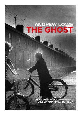
But, after realising that the image’s shape couldn’t translate into a satisfying portrait-oriented design, we trawled the image libraries and I settled on a stock shot of a battered-looking staircase with a boy’s face peeking around the corner from the landing. Again, it seemed to speak to a key aspect of the story – an abandoned house used as a den/hideout by the characters in the childhood timeline.
My designer did a brilliant job of transferring my initial rough idea into a professional-looking cover.
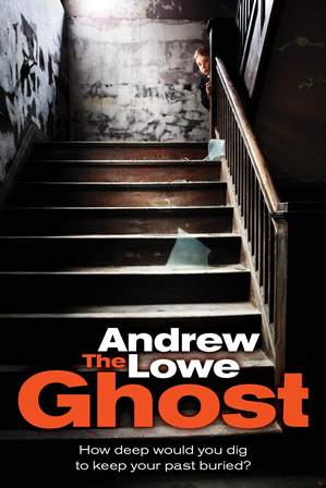
But it felt too on-the-nose. The boy’s face, initially a source of intrigue, started to irritate me. His peek round the corner was too playful, too rehearsed. I needed something with a darker edge.
By this time, I had started to work with Matador and my assigned designer asked me to send over some ideas for the cover image. There’s a moment in the book where the person who appears to be stalking the main character sends a photograph of the now-demolished site of his old school, taken from the opposite side of the street.
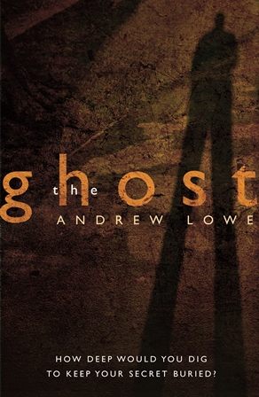
He lifted the phone up close, to eye level, and saw that the sunlight, shining from behind the point of capture, had cast a tall, slender shadow across the pavement where the school gate would have been. The shadow’s arms were raised to its face, elbows jutting, frozen as it framed and shot the picture.
On Flickr, I found a photograph which reflected this – a self-portrait, taken outdoors, with the figure’s shadow absurdly elongated by low sunlight. One of the main themes of The Ghost is the futility of trying to ‘escape’ the past – previous deeds and decisions lingering like psychological hauntings. The image of a long shadow worked well, as it not only made sense as a symbol of this idea but also depicted a pivotal scene in the story, and solved another problem which had troubled me – the novel’s title depicting it as some kind of supernatural/horror story. Here was a shot of a clear human figure, set in the real-world. Malevolent not monstrous, sinister not spooky.
Excited that I’d found my ideal cover concept, I worked up a rough and emailed the copyright owner to ask if I could use it.
He said no. Something about how he never allows his images to be used for commercial reasons.
So I went down to the local park and recreated the shot myself.
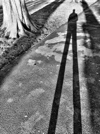
I worked the image into a new rough and my designer produced a gorgeous, grungey orange-washed version with much better integrated typography – and a less blaring tagline. After a bit of tweaking to make sure the cover’s three text elements – author name, title, tagline – had their own distinct identities, I signed off the cover.
FIVE THINGS I LEARNED
1. Don’t be too married to a specific picture.I was guilty of this for the initial stages of design – being convinced that only one image would do. If you choose to work with a professional designer (and you should), I recommend sharing a Pinterest mood-board and peppering it with anything and everything that catches your eye. That way, the process will feel more collaborative and something will eventually rise to the surface – rather than insisting on shoehorning in an image that might be close to your heart but is ultimately unfeasible.
2. Make sure the image speaks to the content.This is an old magazine publishing rule, used as a sense-check for the blending of headline/typography and layout. I worried that my title might give the impression that the book is a supernatural/horror genre title. Hopefully, the final image helps to tether it to the real world. Look at other books in the tribe you want to be considered a part of.
3. Consider using your own photography.Obviously, this won’t be feasible for everyone, but since it’s your story, your writing, your book – why not use your photograph on the cover? I recreated a shot I loved but couldn’t get permission for – and as a result, I set up my book cover and author photo in one go.
4. Balance your elements.I spent a long time faffing around with tagline positioning, but realised in the end that the impact of the image should be top of the hierarchy, next the title (and maybe author name), and finally – if you use one – the tagline should work as a tease to intrigue readers into picking up the book or investigating further.
5. Don’t be afraid to throw everything out and start again. Even with my final image signed off, I had a last wobble where I spent a day wandering around bookshops, taking pictures of covers I liked. My designer calmly convinced me the existing cover was great and that I should stick with it – but I had to go through the process of questioning everything first.
Next time – editing.
The Ghost is published on June 28th by Matador. It's currently available as a time-limited discount pre-order. Details here.
Glad you enjoyed it, Adrian.
Frances - thanks. Fixed!
A fascinating insight into designing jacket cover.
Thanks for sharing.
Just to let you know that the link at the end of the page - to your book - is broken.