W&A Team member and author Clare Povey shares her top website tips for children's fiction authors looking to create a site of their own.

Are you a children's fiction author and deciding whether you need a website? There are are pros and cons as with everything in life. Yes, you will have to maintain and update your website, but it's also an excellent place to promote yourself, your books, as well as resources and information for school visits and other events.
If you're going to invest time and money into creating a one then you will want to put your best foot forward. Here are some pointers on creating a website you can be proud of.
Choose a platform
There are a lot of options out there, so doing your homework is key. I spent some time looking around, but I knew that I wanted a clean looking website, which would be easy to create and navigate. Simplicity is how I live my life when it comes to tech, but of course, everybody has their own varying levels of skills.
Eventually, I settled on Squarespace. One year in and I have no regrets, but if you're looking for other platform recommendations then I know authors who use WordPress, Wix, Weebly. Don't rush into anything. There are plenty 'Pros & Cons' articles out there for you to compare options and figure out what best suits your needs.
Most of the time you can easily see which platform an author has used as it will be incorporated into their URL or at the bottom of the homepage. Here's a top tip if there's an author website that you love, but can't figure out the platform. Simply right click on the homepage and select View page source. Somewhere at the top of the HTML, there'll be a URL that gives you the platform information.
A quick example below is from best-selling YA author Maureen Johnson, Her excellent author website was designed by Moxie Design Studios, but when you click on View page source you can see that they've used Wordpress as the platform.

Final tech disclaimer: Any tech advice in this article will be related to Squarespace because that's what I use! But my general advice on author websites is relevant for all authors creating a website on any type of platform.
So, let's move onto the different pages that make up an author website. What does each page need to do?
Homepage

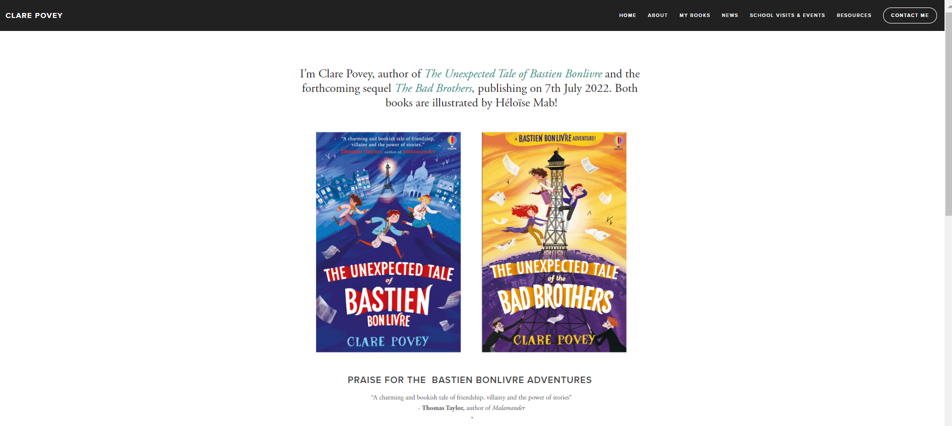
- You can make your homepage as busy or as simple as you'd like! Personally, I like the simple approach. I've included my book covers - front and centre - as I always think that this is what you want potential readers to remember.
- Make sure that your menu is visible, whether it's across the top of the page or on the left-hand side as a drop down
- Include some introductory text welcoming visitors to your website
- LINKS! It's all about selling your books, after all. Make it easy for visitors to buy your book by linking right at the top of your homepage
About

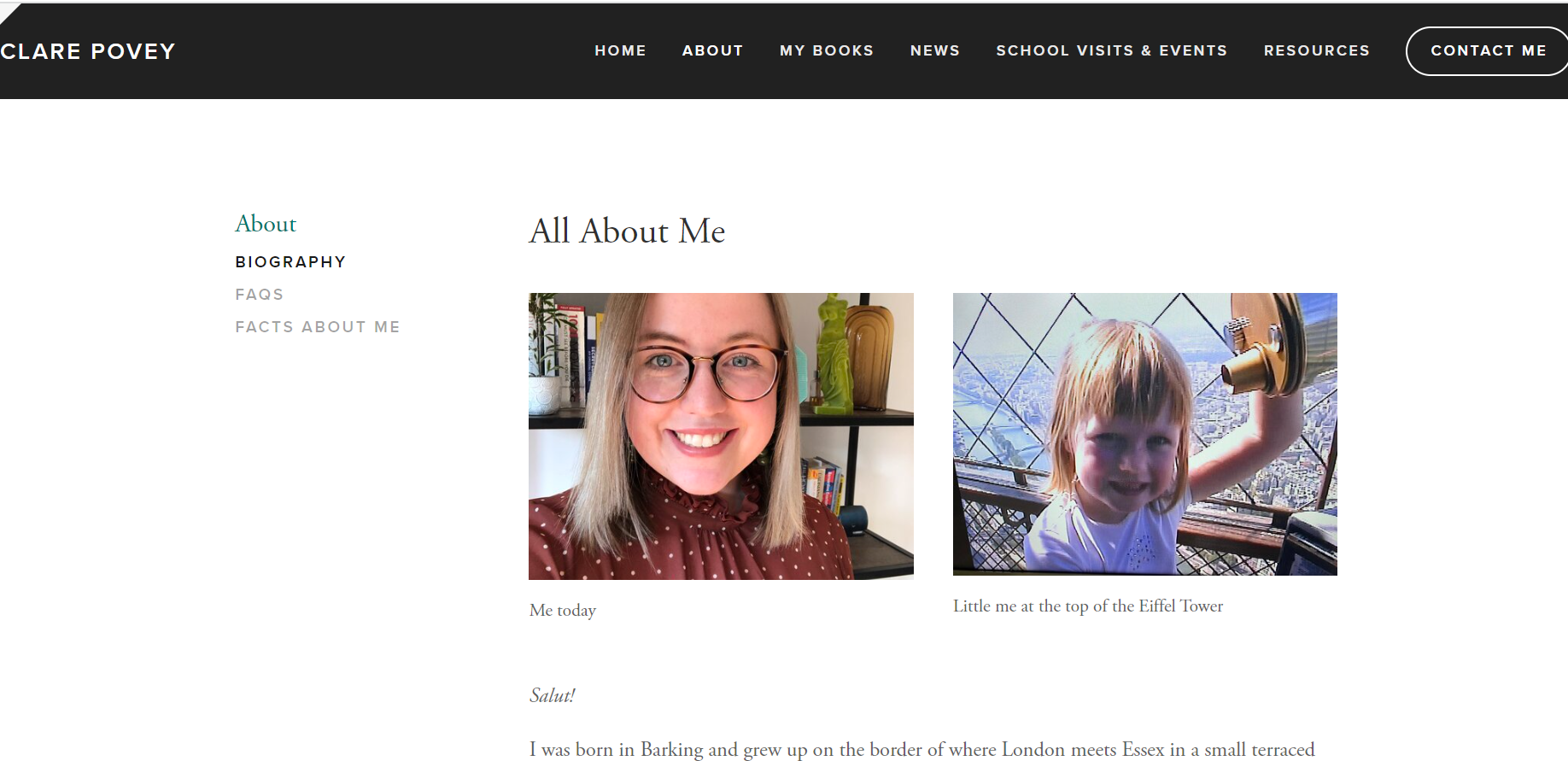
- An About Me page creates a personal connection between you and potential readers. I have three different sections under my About Me: Biography, Facts About Me, and FAQ.
- The Biography page has more detailed information about my life, whereas Facts About Me is a fun page, full of pictures and random facts. It's also a great resource for teachers and librarians who might want to put together author quizzes for their classes. Finally, the FAQ page is somewhere that you can write answers to the most common questions you're asked, e.g. Where did you get your idea from? and Did you do any research?
My Books

- This is the part of your website where you can go into more detail about your book (s). You'll want to include the book cover, the blurb, any award information or nice quotes from other authors, as well as the all-important links! Make it easy for people to order your book.
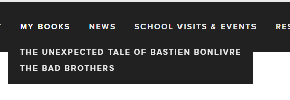
- Underneath 'My Books' heading, I decided to opt for two individual pages as I've only published two books so far. This might make more sense if you're at the beginning stages of your career, like me! But for seasoned authors, you can get away with linking all your books from one page. Otherwise, you run the risk of giving your visitors too many links to click on
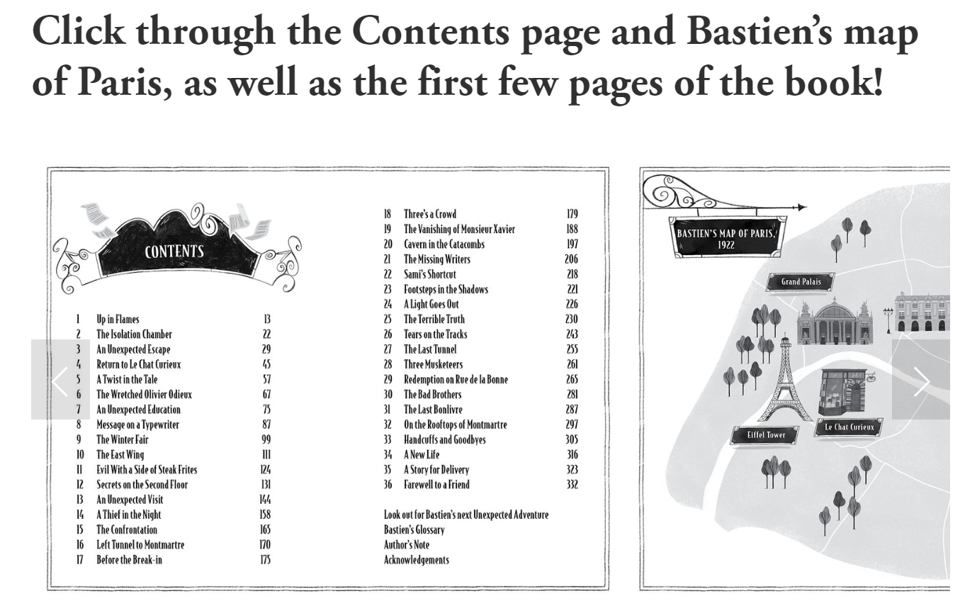
- If you can, include some content from your books to hook people's attention! Squarespace gives you the option to create a carousel and this allowed me to include different bits of content. I displayed the Contents page, Bastien's map of Paris and a few pages of my opening chapter - all to whet people's appetites! If you need any high-res images, be sure to message your publishers for help.

School Visits & Events
- Summarise your school visit options and whether you're taking bookings for virtual or in-person (or both!)
- Include price details. Whether that's a full day rate or the fee for individual sessions, be upfront about what you charge for visits. This will save both yourself and teachers wasted time if their budget doesn't stretch to a school visit. If you need help with this, check out The Society of Author's Guide for Authors Visiting Schools and Libraries. It covers everything from preparing for a visit, bookselling, fees and payment, promotion, cancellation advice and much more.
- Testimonials are a great way to showcase your school experience and they will also help you to receive more visit enquiries! Simply send an email to the teacher you organised your visit with and ask if they'd be happy to provide a testimonial. Teachers are normally always happy to help, but keep in mind that their job is busy and they don't get the chance to check their emails often throughout the day.
- Pictures help to spruce up your school visit page. If pictures were taken during your visit, check with the relevant teacher/safeguarding contact that it's fine for you to share them on your website.
Resources
- Teachers love resources and having a space on your website solely dedicated to them is a great way to build up useful content. The Resources section on my site contains a historical timeline, worksheets, videos, lists of books that inspired me, as well as a walking tour of Parisian locations featured in my books. Think about the themes within your book. If you've written historical fiction, you could write a blog post on the real-life figures and events that inspired your story. Or if you're a fantasy fiction fiend, why not create a world-building worksheet?
Contact Me
- You can decide how much to share here. Some authors create a personal author email address, while others create a contact form. Any contact form requests will be sent directly to the email address you used to sign up to the platform. You can then sort the genuine emails from any spam and reply to any enquiries. Include any other relevant information such as your agent and publicist contact details.
Do you have your own author website? What do you think is a must-have for a children's fiction author? Share your thoughts and own advice in the comments below!
Check out Clare's website to check that she's definitely followed her own advice...
Comments