Good cover design doesn’t just refer to the amount of time or money spent on it. There are many elements within a cover that make it work.

Good Imagery
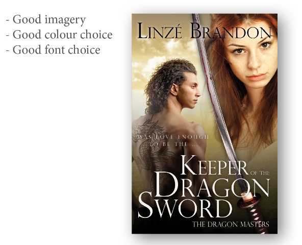
Imagery should be suitable to the period in which the book is set. Here, in a dark-ages style fantasy epic, the images chosen are relevant - the hair on the man isn’t a modern cut, neither character wears modern clothes, the sword is ancient, and the girl isn’t wearing make-up or appears as if posing for Vogue.
The other important key here is that the overall cover is made up of multiple images. A common mistake is to blend images into one another, but not correct the colours in the images so they match. Here a yellow filter has been placed on the image of the girl so she fits with the overall yellow-ish tint of the rest of the cover.
Good Colour Choice
It’s vital to use colours which stand out; white and black here. When using a colour, it should be a hue picked out of the imagery used, or a direct compliment. It shouldn’t just be a random colour which clashes with everything else.
Good Font Choice
The font wants to be something in keeping with the style of the book. If you look at covers in your genre, you’ll notice a trend: chick-lit using curly, girly fonts; historical romance script fonts; action solid, impact style typefaces; literary fiction often uses classic serifs or light sans-serifs and so on. It’s not strict, but chosen right the font will say as much about the contents of the book as the image.
Good Typography
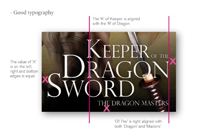
 Composition of the title and author name: here you’ll notice that the title is stacked. Note that the left hand edge of the ‘K’ of ‘Keeper’ is aligned with the left hand edge of the ‘R’ of ‘Dragon’ and so on, whilst at the same time ‘Of The’ is right aligned with the last letter of ‘Dragon’. It fits in a grid which when locked tightly together, is attractive to the eye.
Good Composition
Composition is very much a grid. Like photography, look at your subject and set up your shot to a grid. Here you’ll notice that the title takes up approximately a third of the lower half of the page, whilst the characters two thirds, whereas the horizontal composition is constructed of the man on one half and the woman on the other half, with the sword running through the middle.
Another trick is to line the text up so that it’s of equal distance from say the top edge of the page to the right and left hand sides. If it’s not going to be equal, it needs to be deliberately unequal, otherwise it just looks poorly positioned.
These are all things that designers are trained to do. But good design isn’t just about these elements, and making good choices with regards to what the font you decide on - it’s also about wrong choices.
When you put your book out in the marketplace, your cover works as an advert in itself; you are using it to advertise your novel, your product. Think how irritating it is when you see an advert on television for something and when you buy it and take it home, you discover it isn’t what you thought it was. The same applies to books. If a reader purchases a book that they think it crime fiction, because the cover has all the tell-tale signs of crime fiction, then they may like the romantic fiction you have graced the pages with, but the likelihood is they will be sorely disappointed and the unwritten contract you have with your reader has been broken - because you have given them a cover which does not resemble what is inside.
Think about it this way; it’s like having a can labelled Baked Beans, only to discover that, instead of sitting down to enjoy the aforementioned beans - you're stuck with canned peas.
JD Smith (Jane) lives and works in the English Lake District. Having worked as a graphic designer since the age of 17, her passion for books and everything literary took over and she now works predominantly on book cover design and typesetting. She is the editor of the writing magazine Words with JAM, and the author of Tristan and Iseult and The Rise of Zenobia, the Overlord series, published with the Triskele Books collective.
Comments