While making an ebook is pretty straightforward, putting it into print is more challenging.

In traditional publishing houses, it’s an entire department’s job. You can’t just print a Word file as is; each page has to be designed and fine-tuned, even in a novel. You wouldn’t be aware of this when you look at a print book, but you would if it wasn’t done. Follow these steps to give your book that professional finish.
The first thing to understand is that this process is not about how the text reads – it’s about how it looks. If you have illustrations or tables, you’ll probably already be aware of the visual elements in your book. But even if your book is straightforward prose, you need to be aware of the shapes the paragraphs make on the page. It’s quite normal to adjust the line breaks and the text itself to make the book more visually appealing. That might seem like the tail wagging the dog, but it’s how we make the book look as attractive as possible.
Who should print your book?
In the old days, self-publishers had to order batches of books but now you can get them printed one at a time, as a customer orders them. It’s called print on demand and the technology is so good that these books are pretty indistinguishable from books produced in more traditional ways. Indeed, major publishers are also using print on demand for some of their backlist.
There are three major print-on-demand companies: CreateSpace, Lightning Source and Lulu. For ease of use I recommend CreateSpace. They make the whole process easy for first-timers, and as they’re affiliated with Amazon, so they integrate smoothly when you come to sell the book. And there are no set-up costs.
What software do you need?
At the simplest level, you can do all your interior formatting in Word. CreateSpace provides custom Word templates that are simple to use, even for those of average expertise. You can submit the final book as a Word file or a PDF, which I prefer because there’s less that can accidentally be changed at the CreateSpace end - although there seem to be very few cases where this happens so it’s probably more of a theoretical advantage than a necessary safeguard.
A note from a purist: Word isn’t designed as a page layout tool. You get more professional results with a program like InDesign or Page Plus, which give you finer control over the text’s appearance. But for a straightforward prose book, Word will do a neat job.
In any case, a professional finish isn’t created by fancy typesetting, it’s from consistency and readability - as you’ll see. Watch for those words and take them very seriously; I’ll be repeating them often.
What size do you want the book to be?
Choose this first, because it governs how much text you get on each page. There are standard paperback sizes, and I’ll take two as examples - 5 inches x 8 inches, and 6x9.
The fewer pages you have, the less the book will cost to produce - so bigger pages mean you don’t have to charge so much to make a profit. But if your book isn’t thick enough it will look flimsy. Conversely, if it’s very chunky, it will cost a lot more to produce, and you might price yourself out of the market.
As a rough rule of thumb, start with your word-count.
One of my own books was 40,000 words. If I chose a trim size of 6×9, it made about 120 pages, which was too thin. When I resized to 5×8, the thickness and size felt right. On the other hand I had a novel of 103,000 words. It would be rather hefty at 5×8 and expensive to produce – which means I would have had to charge far more than other equivalent books. But at 6x9 it made 360 pages, came out at a reasonable price and - also important - fitted nicely with other literary novels. (If your book doesn’t look like others of its genre, bookshops might not be keen to stock it.)
How do you get a page count?
CreateSpace lets you try different options. Set the page size to 5x8 and download an interior template. Change it to a bigger size and download that. Try options in between - those aren’t the only sizes. Load your text, get a rough page count, then use CreateSpace’s price estimator for the permutations of page count and size. The book’s length will change as you work on it, because you’ll add chapter headings and page breaks, but this will do as a rough guide to help you start.
Set up your master page
Once you’ve decided your book size, you need to set up a master page. All your pages need uniform margins and a standardised text space. CreateSpace handle this for you in their interior template. If you’re using anything other than CreateSpace’s Word template, I suggest you check your margins. Design programs like PagePlus will generate default margins when you select a page size, but they may have been set up for leaflets and magazines. Paperback books need more generous margins, especially in the middle (known as the gutter), as they don’t lie flat and they are more dense with text.
Here’s how you check. Whack some dummy text onto the page, print it out and slip it into an existing book of the same size. Adjust until it looks right.
Consistency alert: it’s important to get your margins right before you do any other work. If you change them later, you’ll have to redo a lot of checking (which will be tedious).
Moving onto the text
Dashes, quotes and apostrophes
There are several ways to do these punctuation marks, and they need to be consistent throughout the book. When you formatted the Kindle or ebook edition you probably tackled this, but just in case you didn’t...
Be strict about when you use single or double quotes. Ensure they are curly quotes and not ticks, including the apostrophes. These are known as ‘smart quotes’. You can fix this with the ‘find and replace’ option. Versions of Word differ, but you can find detailed instructions by typing ‘smart quote’ into the help box.
Also take notice of dashes. There are several lengths of dash. When we’re typing, we tend to hit the hyphen key, but print books use a longer dash called an en-dash or an em-dash (one is longer than the other - check a print book and you’ll see). If you mean to use a hyphen, put a hyphen. If you want a dash, convert it to an en or an em - these are in the ‘symbol’ menu under ‘insert’ . Choose which looks right according to your visual taste, but make them (repeat after me...) consistent.
These two fixes will make your text look a lot more professional.
Typeface for your main text (also known as body text)
Consistency note: printed books need one typeface for the body text - and one only. It also has to be the same size all the way through, and the lines have to be spaced evenly. Even if you have multiple narrators, timelines or half of the book is letters, you’re better delineating them with headings or narrative devices rather than different typefaces and sizes.
If you’re using a CreateSpace’s fully formatted template, the typeface and size is chosen for you. If so, paste it in and skip to the section ‘Widows, orphans – the mysterious fiddling I was leaving until last’.
If you aren’t using CreateSpace’s formatted template, choose your body text style now. And make your decision final. If you change your mind, you might have to redo a lot of fine-tuning because every typeface takes up a slightly different amount of space on each line. A paragraph set in one font might be three lines long; in another it might be two or four. This will matter later!
Your main text needs to be clear and readable. This is not the time to use the vast number of fancy curly typefaces on your Word menu!
At the other end of the scale, don’t choose a sans serif font for body text. (Serifs are the little feet that embellish the ends of the letters.) Although sans fonts are very clear and plain, they aren’t friendly to read in dense paragraphs on wide pages, as you get in a novel. The serifs create a visual effect that makes it easier for the reader to follow the lines. They are, however, good when used in short bursts, such as for inset tables, footnotes, magazines or web pages.
How do you choose a suitable typeface?
Your template might come with them, or you could find a few novels in your genre (tastes in typefaces may vary between genres) and choose typefaces that look like them. Sometimes the font is mentioned in the copyright page, and they’ll even tell you the type size (more on that in a minute). Good choices are Garamond (which is on the CreateSpace formatted template), Janson, Caslon and Century Schoolbook (which is the typeface I use in the pictured examples). It’s best not to use Times, it makes a book page look like a business proposal.
Italics
Check what the font’s italics look like. A lot of computers have only the Roman version of fonts but not the italics, and when you hit the I icon, the software slants them. True italics have curled serifs (the little feet); slanted feet look wrong. If you haven’t got the italic version of your font, there are free places to download it – I found my Century Schoolbook italics here. Do this now too, for the mysterious tedium-avoidance reason I will explain. (Notice also that italic letter forms are different: the k and the a particularly.)

Italics: flat feet bad
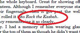
Italics: curly feet good
Should you check the bold version of the font?
Purists would say yes, but the bold version is not as different as the italic. And bold is rarely needed in novels.
Typesize and spacing
What size should your body text be?
Most books are set in 12 point, or 11.5 point. Again, compare with other published books in your genre (for instance, literary fiction can afford to go smaller than YA).
Your page size will be significant here. If your book is 6×9 the page is quite wide, so you might want a bigger typeface or wider leading (space between the lines) than if it’s 5x8. Obviously, the bigger typesizes will take up more pages, but if the type size is too small and the margin too wide, it might be impossible to read (like fine print in a contract). You can fine-tune these features in Word by editing the paragraph style – for my book (illustrated here), I set the leading as a percentage of the pointsize. So I had 11.5pt type on a leading that was a niftily precise 14.375pt – or 125% of the point size.
Also, each typeface has different properties. Some have tall ascenders and descenders (vertical strokes). So if you change from one font at 11.5pt it might look visually smaller and less readable than another, and you might need to increase the type size.
Do a few experiments, including a print test. Pages look very different when visually surrounded by all your usual onscreen frames - the Word dashboard, your desktop and other familiar icons. When you get a permutation you like, print it out and fold it into a book of the same size to see how it looks in the flesh.
When you’re happy, run your text in and typeset it.
Fancy stuff like chapter heads
You can leave the chapter title in the same font as your body copy, or you might want something eye catching to draw the reader to the first line. You could use a simple motif or a drop capital if your design skills allow, but a very simple and effective option is to put the first few words in small capitals, indent radically (or not at all) or set the chapter headings in a contrasting font. (Again, avoid the very fancy fonts that Word provides for the eager and unwary). For my chapter headings, I used Copperplate Goth BT, which is the font on my cover - another piece of design consistency.
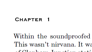
Chapter titles don’t usually begin at the very top of the page. You’ll want to add line spaces, both above the chapter heading and afterwards, before the actual text starts. Experiment until you find an arrangement you like. Then write down exactly what it is – eg 3 carriage returns above and 2 below. Or code it into the paragraph format, if your Word skills allow.
Consistency note: do exactly the same for all the chapters. Properly typeset books are obsessively consistent about every detail.
You’ll also need a gap between sections that aren’t chapter breaks. Decide a style for this too. How many line spaces will you have? Do you want a little motif in the middle? What about the paragraphs? Do you want them full out (not indented) after a section break?
This is the usual option but I have seen indents work nicely as well. Make your decision, write it down – and do the same thing every time.
Then go through the manuscript and put them in.
If you formatted for Kindle, you probably added page breaks in for chapter endings. If you formatted for other strains of epub, you probably didn’t use page breaks. Go and add page breaks for chapter endings now. Don’t rely on carriage returns to split the book or you will find the later stages incredibly frustrating. Trust me on this.
Blank pages and front matter
Before you get to the text proper, you need set-up pages, known as front matter or prelims. Look in any published book and you’ll see.
Also, certain parts of your book must begin on right-hand pages, so you might have to put blanks in to achieve this.
Usually these are:
- half title (right-hand page) – where you can put biographical info too
- copyright notice and ISBN etc (left-hand page)
- full title (right-hand)
- either blank or acknowledgements (left-hand page)
- start of book (right-hand page) or part 1/section 1 title page (right-hand page, then blank, then text proper on right-hand page)
The detailed CreateSpace template does these for you. Otherwise, use page breaks whenever you need a blank.
Blank pages and prelims don’t have folios (another amateur mistake). Strip them off if your program allows or change the text colour to white so it doesn’t print.
Widows, orphans – the mysterious fiddling I was leaving until last
Now you have the biggest, most nitpicking task of all. You have to look for bad breaks at the tops of pages – widows, orphans and stumps.
- Widows and orphans are short lines in places you don’t want them – at the very bottom of a page or the very top.
- Stumps are words broken by a hyphen so that the first half of the word is on one page and the second half is on the next.
All these can look ugly, although sometimes you can get away with one if there’s enough text on the rest of the page – it’s very much a matter of personal taste what’s acceptable and what isn’t.

Get this line back or make it longer...
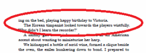
...but this is okay
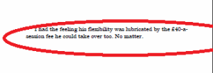
All on their own...take these lines back to the previous page or push a few more over...
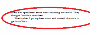
...like this.
Also look for section breaks in awkward places. If you have a section break, you want more than one line below it or it looks weird. And you don’t want a page with just 1 or 2 lines hanging in mid air and then the chapter end.
NB – most word processing programs have an auto setting to get rid of widows and orphans. Turn it off. It results in short pages, which in a text-heavy book like a novel looks dreadful. I’m afraid you have to do these adjustments by hand.
How do you adjust?
- DON’T squeeze the letters together with kerning – that looks awful.
- DON’T alter the text frame
- DON’T sneakily change the point size or the leading – the inconsistency shows.
DO: alter the text itself.
Remember when I said this isn’t about the text content but how it looks? This is what I mean.
Your options are:
- close up paragraphs or make new ones
- cut out extraneous words to pull a line back, add a few to push one over
- if you have sub-headings (weird in novels but de rigeur in non-fiction) add or delete one
If there’s no scope to edit on the page you’re on, go back a page and fix it there. Sometimes you may have to go back a few. And keep checking the results.
This is fiddly and you have to do it for every single page. And now you can see why you want to make all your other design decisions beforehand. And why you need to separate your chapters with page breaks, so that any change you make is confined to just a few pages. If you use carriage returns instead of page breaks, every change you make will affect the rest of the entire book.
If you’re not practised at this, it’s best to do several passes through the book, looking for one problem each time, until you get your eye in.
Once each of your pages looks typographically beautiful, proof-read it one last time, remembering to check your chapter breaks are consistent. Then your text is ready to upload. Phew.
And after all your hard work, don’t forget to check the proof. CreateSpace gives you an onscreen proof checker, which is worth looking at closely because sometimes the formatting doesn’t translate quite as you expect. Once that’s done and your cover is ready, order a print proof as well before you finally unleash your book. Good luck!
Roz is an author, editor, writing tutor and book doctor. She has worked in publishing for more than 20 years, run editorial departments, ghostwritten bestselling novels for other writers, critiqued for Cornerstones literary consultancy and also writes fiction as herself.
She has a no-nonsense blog for writers and self-publishers, Nail Your Novel, a series of writing books by the same name (Nail Your Novel: Why Writers Abandon Books and How You Can Draft, Fix and Finish With Confidence and Nail Your Novel: Bring Characters To Life) and her first novel is now available (My Memories of a Future Life). Follow her on Twitter as @NailYourNovel.
Comments