The old adage says ‘Never judge a book by its cover.’
But I’m afraid that this is exactly what many of today’s book purchasers do. With such a wealth of books available to choose from, having a strong, professional looking book cover is one way to stand out from the crowd. Of course, an exciting blurb and a well-written story are also very important, but you only get one chance to make a first impression. Whether you create the cover yourself or work with a designer, there are several things to consider when designing a cover for your book:
- Make the finished design as professional as possible. Just as your story should be properly edited and formatted, so too should your cover look as though it has been designed professionally.
- How the design works at different sizes. You may have commissioned a beautiful painting or detailed photograph that looks amazing at full size, but which loses many of the details when it’s at thumbnail size (the online display size for your book). Using strong text elements can make it stand out more when it’s at a reduced size.
- The style of your cover. The type of font you use and the image you choose should suit the story inside. For example, flowery curling fonts are well suited to novels in the romance genre.
- Repeating Elements. If you’re writing a series, creating a design element to be used on all book covers throughout will tie the whole thing together and give readers a strong visual to guide them through the series.
Another thing you may want to consider is how the cover looks in black and white, as this is how it will display on most e-reader devices. Even though at that point you’ve probably already made a sale, a well-designed cover will catch the eye, especially if the reader has a lot of books to choose from.
Many writers who choose to self publish also choose to use stock images for their cover artwork. There are several reasons for doing so: the images are sharp and professional, they are easily found online, and it's not always possible to take the photo you need yourself. Many years ago, I used to work in advertising, and one of the roles I held involved purchasing all stock photography for a large agency. I had to negotiate rights and usages for each image, so it would be fair to say I know a little bit about the process. Stock photos tend to fall into one of three categories:
- Rights managed. These are images which require rights to be purchased for their usage. These fees are based on number of uses, the area where the image will be used, the length of time it will be used for and a few other variables, including fees paid to models who may appear in the image. Therefore, I wouldn't recommend using this type of image for your cover, as it's quite difficult to predict how many copies you will sell or where, and to purchase a blanket usage license would be quite costly!
- Royalty Free. These are images for which you pay a single fee, then you are free to use them as often as you like, wherever you like. Therefore, they are quite useful for use in cover designs. However, you do not own the exclusive rights to the image so it can be used by somebody else at any time.
- Free. There are lots of sites offering free stock images, some of which are excellent. However, some downsides can include the images not being of the best quality, or that you have to enrol and pay a subscription fee to access the images without watermarks. Also, I have seen some free sites with the disclaimer that images are not to be used for commercial purposes, which then discounts them being used on the cover of your book. I recommend to always check the fine print before using any of these images.
You could also try taking your own photographs. I’ve shot some really nice images with my iPhone and it’s fun to play around with them and see what can be created. Even Microsoft Word has a number of tools to add filters, change colours or exposure, or crop the image into something much smaller.
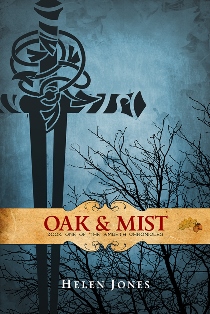
When it came to designing the cover for Oak and Mist, I wanted it to have a vintage feel, like the embossed leather books you find in antique shops. As I knew the book would be part of a series, I also wanted an element that could be used across all the books, tying them together as a set. I worked with Rich Jones at Turning Rebellion (who also happens to be my brother) - the sword image is my own illustration, then my clever (brother) designer came up with the band element and the wonderful shaded background. Suffice it to say I’m very pleased with the end result.
Of course cover designs are as subjective as stories themselves – some people will love what you’ve done, while others won’t like it at all. But if you present the most professional, well-designed cover you can, I think that’s half the battle.
You can read more about Helen’s experiences as a writer on her blog. Her first novel, Oak and Mist, is published through Amazon. She is working on the next five novels in the series, with more ideas following behind. Find her on Facebook and Twitter.
You're very welcome, Jonathan - glad you enjoyed it :-)
Hope everything works out with your cover image as well x
Useful post - thanks very much :D
I suspect I'll be in a similar position very soon. The cover image I'd like to use for my WIP needs permissions so it's handy to have pitfalls pointed out.